# flex布局
- flex常见属性
- flex-grow,flex-shrink,flex-basis
- flex:1
- space-evenly
- flex布局实例
.item {flex: none;}
.item {
    flex-grow: 0;
    flex-shrink: 0;
    flex-basis: auto;
}
.item {flex: auto;}
.item {
    flex-grow: 1;
    flex-shrink: 1;
    flex-basis: auto;
}
.item {flex: 1;}
.item {
    flex-grow: 1;
    flex-shrink: 1;
    flex-basis: 0%;
}
.item-1 {flex: 0%;}
.item-1 {
    flex-grow: 1;
    flex-shrink: 1;
    flex-basis: 0%;
}

.item-2 {flex: 24px;}
.item-1 {
    flex-grow: 1;
    flex-shrink: 1;
    flex-basis: 24px;
}
.item {flex: 2 3;}
.item {
    flex-grow: 2;
    flex-shrink: 3;
    flex-basis: 0%;
}
flex-basis 规定的是子元素的基准值。所以是否溢出的计算与此属性息息相关。flex-basis 规定的范围取决于 box-sizing。这里主要讨论以下 flex-basis 的取值情况:

auto:首先检索该子元素的主尺寸,如果主尺寸不为 auto,则使用值采取主尺寸之值;如果也是 auto,则使用值为 content。

content:指根据该子元素的内容自动布局。(内容多的占比也会多)

百分比:根据其包含块(即伸缩父容器)的主尺寸计算。如果包含块的主尺寸未定义(即父容器的主尺寸取决于子元素),则计算结果和设为 auto 一样。
- space-evenly为项目之间间距与项目与容器间距相等,相当于除去项目宽度,平均分配了剩余宽度作为项目左右margin。
# flex 布局实例
- 场景:一行5个卡片,卡片数量不限,自动换行,从左到右排列,比如现在有9个卡片:
// 如下效果
1 1 1 1 1
1 1 1 1
- 每一行子元素的总基准值是:20% * n
- flex-grow 和 flex-shrink 都是 0,不允许放大和缩小,除基准值之外的剩余空间不会被分配
.list {
  display: flex;
  flex-flow: row wrap;
  justify-content: start;
}
.item {
  flex: 0 0 20%;
}
- 场景:如何实现以下效果,文字部分左对齐,数字百分号部分右对齐
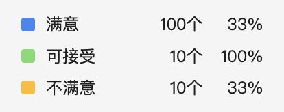
<div class="wrap">
  <div class="icon"><span></span></div>
  <div class="name">满意</div>
  <div class="num">100</div>
  <div class="percent">10%</div>
</div>
.manner {
  display: flex;
  align-items: center;
  flex-direction: row;
  .icon {
    text-align: left;
    flex: 0 0 10%;
  }
  .name {
    text-align: left;
    flex: 0 0 35%;
  }
  .sum {
    text-align: right;
    flex: 0 0 30%;
  }

  .percent {
    text-align: right;
    flex: 0 0 25%;
  }
}
使用百分比的原因是在外层盒子变化时,里面的元素也会跟随着变化。
对齐方案使用 text-align 即可。
← 盒子模型 圣杯布局和双飞翼布局 →